Econscius looked into economic inequality by state and found some surprising facts. Which state did you think has the most economic inequality, defined by the government’s Gini ratio? Did you guess Texas or Alabama? The Gini ratio measures unequal outcomes in wealth; a ratio of 0.0 would mean everyone had exactly the same and a ratio of 1.0 would mean one person held all the wealth.
The District of Columbia has the highest level of inequality (Gini ratio of 0.532). New York has the highest state ratio at 0.502, followed by Connecticut, Texas, Louisiana, Alabama, Mississippi, Illinois, Georgia and Massachusetts which rounds up the Top 10 with a score of 0.468.
The state with the lowest Gini ratio is Alaska at 0.402. Utah is second most equal at 0.414, followed by Wyoming at 0.415.
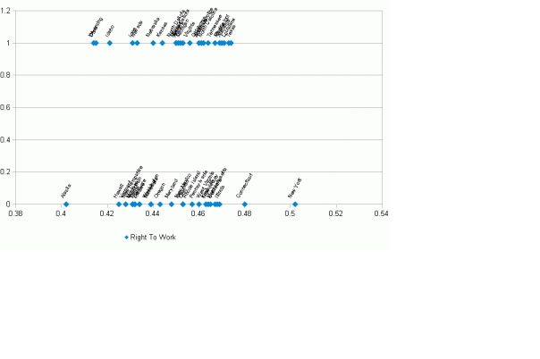
Econscius ran several regression analyses of the most recent state Gini ratios, looking for correlations that would help identify the cause(s). First, I compared “Right to Work” states against the tally of state Gini ratios, expecting the comparative absence of unions might be a factor. “Right To Work” states prohibit closed shops (mandatory unions). But there is no statistical correlation (RSquared = 0.01), which can be easily seen by the high rate of dispersion in the graph below. An interesting follow-up may be to see if there is any difference using the unionized proportion of the workforce in place of Right To Work state.
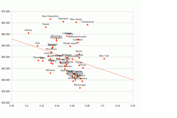
The scatterplot below shows a rather loose relationship between average income and Gini ratio. The trend line shows high income states tend to be slightly more equal than lower-income states. (R-squared is 0.08). In statistical terms, income and Gini ratio should be impacted by co-variance (the two variables are not independent of each other), making it a less than ideal measure.
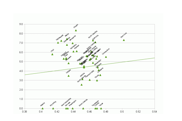
Next, I ran a regression of Gini ratio against Net State Income Tax Rate, as calculated by the National Bureau of Economic Research. The NBER is best known as the group that officially dates recessions. As seen in the graph below, the trend line is the opposite of what one might expect. Higher state income tax rates actually imply slightly higher inequality (R-squared 0.08).
The scatterplot graph below clearly shows how the highest inequality states of New York and Connecticut have high taxes and several of the states with no income tax have the lowest Gini ratios, e.g. Wyoming and Alaska. While higher income taxes are not well correlated with equality, an observation is states known for high property taxes (which are regressive) are bundled amongst the most unequal, including New York, Connecticut, New Jersey, Florida and Illinois.
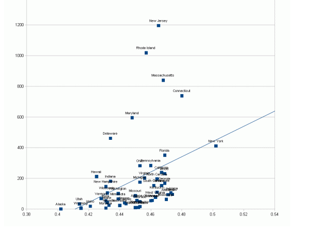
Lastly, let’s look at state Gini ratio vs. population density (people per square mile) . This regressed variable has the strongest correlation with Gini ratio (R-squared 0.14).
Why would sparsely populated states be more equal and densely populated states have a greater gap between the rich and poor. I hypothesize higher density means more urbanized areas, which means more specialization of skills. The economic concept of division of labor shows how the greatest economic benefits come from having each person focus on what they are most economically productive at and then trading their output with the output of someone else for all other items. One way to think of it is to imagine Steve Jobs working in isolation in a rural area. He would have less time to spend inventing computers and whatnot if he was unable to employ other people to mow his lawn, clean his car and other household chores. Imagine if he had to do his own legal work, build his own house, cook his own food because there were no restaurants, etc.
Large cities allow a high degree of division of labor. Urban areas tend to be centers of economic specialization. There are centers of specific industry specialization such as entertainment in Los Angeles, energy in Houston, finance and media in New York, insurance in Hartford, government in Washington DC, pharmaceuticals in New Jersey, autos in Detroit and technology in San Jose. Most cities provide network benefits for commerce. Corporate headquarters are mostly found in large metropolitan areas as employers can easily find necessary skilled workers in management, marketing, human resources, accounting, law, consulting and finance.
The concentration of highly paid professionals in these large cities also leads to a concentration of poorly paid service workers because of the high degree of division of labor. Whereas a small town worker may handle many household chores on their own, the highly compensated professionals around big cities like Los Angeles and New York hire maids, nannies, gardeners and even dog walkers. They outsource some of their work to dry cleaners and restaurant employees. They also may do more retail shopping, which means more need for low skill, low wage workers at retailers plus truck drivers and distribution center workers to deliver the goods. It is no surprise, then, that large cities like Chicago, New York, Detroit and Los Angeles are both very rich and very poor at the same time.
The wealthy professionals living in Atherton, CA, Huntington Beach, CA, Wilmette, IL, Grosse Point, MI and Irvington, NY trade some of their copious amounts of money for leisure time by sub-contracting low skill work like house painting and pizza delivery to low skill workers. These low skilled workers are generally paid below average wages, which helps explain why the large cities, and the states they reside in, are both rich and poor. This helps explain the high Gini ratios in the more densely populated states.
These four regression analyses do not explain all of the differences in Gini ratios. While income tax rates have no relationship, it is possible a measure of to marginal tax rates on the rich may be a factor. We did not look at state and local sales and property taxes. Other possible explanations may include educational attainment dispersion within each state, the types of industries prevalent in a state, immigration levels, and even cultural differences between states.
We found New York is actually less equal than Texas, which probably surprises most people but likely reflects the high density of population in metro New York City where many highly compensated, high skilled workers reside as well as many low pay, low skill workers who serve their day-to-day needs. As we have seen in my posts on Texas, (https://econscius.wordpress.com/2011/09/03/stellar-texas-job-growth-in-above-average-wage-cities/) it is increasingly densely populated and affluent in its large metro areas of Dallas, Austin, San Antonio and especially, Houston. Metro Houston is the 3rd largest home of Fortune 500 HQs and is now the major home of the energy industry’s professional staffs (senior management finance, legal, accounting, engineering). Progressive, union-friendly states like Connecticut and Massachusetts are less equal than Right To Work states like Nebraska and Kansas. It appears one factor is the densely populated concentrations of skilled workers such as hedge fund and insurance workers in Connecticut and biotech and technology in suburban Boston.
I believe Gini ratio and measures of inequality are overhyped. If a richer neighbor of mine accidentally drops some of his property, say his iPod, in a river, inequality has been slightly reduced but am I better off? Nevertheless, the evidence on state Gini coefficients suggests there is no diabolical plot causing high inequality. Several of the least equal states like New York, Massachusetts and Connecticut are reliably Democratic, high tax and union friendly. The District of Columbia is the most unequal of all. The inequality must come from other sources, certainly including the concentration of highly paid, skilled workers in those states.
Notes:
Chart 1: 2009 Gini coefficient data (latest available) from http://en.wikipedia.org/wiki/List_of_U.S._states_by_Gini_coefficient retrieved 10/18/11. Right-To-Work states from http://en.wikipedia.org/wiki/Right-to-work_law retrieved 10/18/11.
Chart 2: 2006-7 average data (latest available) from http://en.wikipedia.org/wiki/List_of_U.S._states_by_median_income retrieved 10/18/11.
Chart 3: 2009 data (latest available) from http://www.nber.org/~taxsim/state-marginal/avrate.html, retrieved 10/19/11.
Chart 4: Population Density from http://en.wikipedia.org/wiki/List_of_U.S._states_by_population_density retrieved 10/18/11.
Pictures from Wikipedia Commons.
Your comments are welcomed! What do you think causes inequality?


[…] Following up on my state level inequality post, the Census Bureau has now released metro area details, also based on Gini ratios. [1] New York City has the greatest level of inequality, which is quite consistent with the hypothesis I advanced in https://econscius.wordpress.com/2011/10/21/which-state-has-the-most-inequality-texas-or-new-york-why/. […]
[…] For more on income inequality in New York City, please see my recent posts https://econscius.wordpress.com/2011/10/28/which-city-has-the-most-inequality-new-york-or-salt-lake/ and https://econscius.wordpress.com/2011/10/21/which-state-has-the-most-inequality-texas-or-new-york-why/. […]